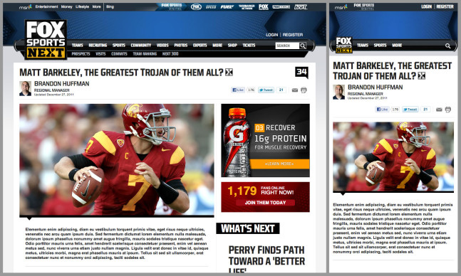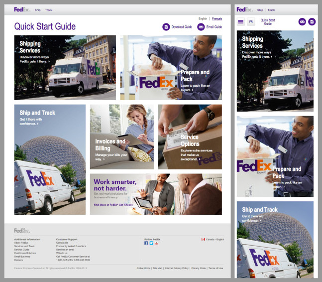
For this project I converted a work-in-progress, static-width site into a fully responsive layout. Back-end integration was well underway when I joined the project to take on the newly introduced responsive design requirements. For this reason, restructuring of HTML was kept to a minimum.
View the responsive template »

I was the sole front-end developer for this fully responsive site. I developed the front-end templates using Middleman, making use of Ruby templating and Sass/Compass. I assisted with back-end integration on the Adobe CQ platform.
View the site »

This very website provides a great example of my work. Designed and built entirely by me (with the exception of the great logo design by Brent Wood), this website displays my skills with Photoshop and front-end development. This website also demonstrates my ability to implement responsive design techniques, as you can see by loading this website on your mobile device or simply re-sizing your current browser window (make it narrower).


