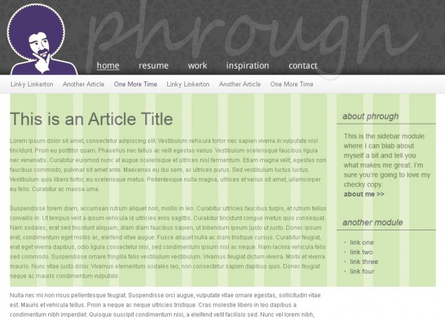
Responsive design is a fairly new approach to design and front-end development which allows a page to be rendered using different css rules depending on the viewport of the visitor’s browser. While it doesn’t work well for all cases, it can be a great approach to creating a site that’s pleasant on all devices while serving from a singular source, allowing development to abandon the practice of user-agent checks via an htaccess file that redirect to an independent mobile site.
For an example of responsive web design, resize your browser window with this site loaded (change the window width drastically, assuming you’re on a device which allows resizing) and pay attention to the changes in page layout.
Other examples of responsive design:
webdesignerwall.com
http://www.informationarchitects.jp/en/
Including response.js will allow responsive designs to work in IE6-8.
With the introduction of the canvas element, it is now possible to render and modify vector graphics within the browser. Paper.js provides a javascript framework for drawing and manipulating canvas elements.
To view these examples, you will need a quality webkit browser, I’d recommend Google Chrome.
Examples
http://www.android.com/
http://music.google.com/about/tour/
I believe that quality front-end code starts with thoughtful design. To that end, I love the idea of working with grid systems like the 960 Grid System. If designers can work within a set of rules, it will result in a harmony between design and development that will lead to a better experience for the site visitors. With this in mind, I made an effort to design this site using a simple grid system.

People are doing great things with CSS3. Checkout these CSS3 based background patterns.
In recent years, quality front-end frameworks have begun to surface. With lots of tools and options rolled in, these frameworks have helped developers quickly get their projects up and running. My favorite front-end frameworks are Bootstrap and Zurb’s Foundation. In order to keep your site’s download speeds reasonable, it’s important to be selective when utilizing these frameworks and include only the pieces you intend to use.
There are an incredible number of great new tools available for front-end developers today. Middleman is a ruby-based “static site generator using all the shortcuts and tools in modern web development” and is one of my favorites. While it’s geared for developing static sites, I’ve found it extremely useful for developing templates to be used with fully dynamic sites. It allows you to break your pages down into separate, singularly maintainable components (header, footer, navigation, etc.). It also has sass/compass support built in, and browser auto-reload when changes to files are saved. Once your happy with your templates, you simply run the build command and it generates your static HTML templates, including minified CSS and JavaScript.
I’m very interested in preprocessors, both JavaScript and CSS based. They provide improved organization through logical code separation and time savings through the use of mixins, variables, and functions. Sass is a great Ruby based CSS preprocessor. Compass is an extension of Sass which adds even more power, including the addition of reusable patterns (easily import common css normalizers, boilerplates, etc) and one of my favorite features, automated sprite image and css generation. Stylesheets have never been so powerful.
Web components bring a new way to modularize web applications through use of the shadow DOM. Polymer is a Google backed project that provides an easy web component implementation with a limited number of polyfills for older browsers lacking in support. Google also unveiled Material Design at Google I/O 2014, the visual language to be used in the upcoming version of Android. With it, they announced the availability of Polymer based implementations of Material Design.
One downside of Polymer at the moment is that each component imported into a page requires at least one additional server request, and if that component has dependencies it will make at least one additional server request per dependency. This can compound quickly and relatively simple pages will make an exceptionally high number of requests. This might be overcome with some type of build process that embeds referenced components directly onto your page before serving them to reduce the number of server calls.
.editorconfig files help developers on a shared project maintain a consistent coding standard and approach. This file should be checked in to a projects repository, and modern IDEs and editors support these files to enforce a projects coding standards (think tabs vs spaces, whitespace at EOL, etc). Check out editorconfig.org for more information.


